
UI for a Chat Application
Designing a seamless P2P payment experience in a messenger
The client is a UK-based consulting and auditing company. They considered creating a chat application to replace cash transactions with online payments.
Solution

Design Process
The customer didn't require a fully functioning MVP, which allowed our team to focus on the design. In close cooperation with the client we followed the principles of Design Thinking and Double Diamond to create an interactive prototype with Invision. When we tested the UI design with real users, we were able to make speedy changes, thus reducing the costs usually associated with change requests.
Market Research
To design an intuitive user interface, we drew inspiration from popular messaging applications available on the market. We analyzed Facebook Messenger, WhatsApp, and WeChat, identified similarities in the UI element positioning and color schemes, and implemented them in our interface.
Use Cases
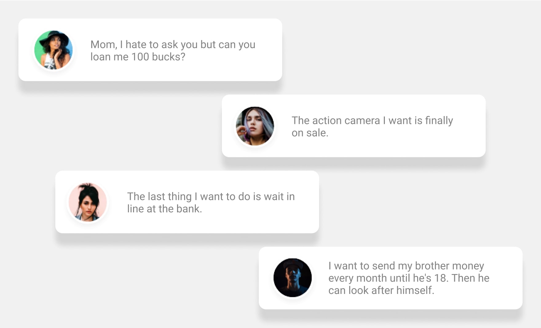
Next, we identified the use cases for the application. To that end, we developed fictional characters representing potential users, and modeled possible use case scenarios:
1. A user has gone over the budget and needs help from friends or family
2. A user finds himself/herself in an unforeseen situation when money is urgently needed.
3. A user regularly pays bills with a mobile phone because it is faster and more convenient.
4. A user frequently sends money to his/her relatives.
UI Sketching
Next, we thought out the money transfer flow and sketched it out. To receive money from another user, it is necessary to:
1. Log in
2. Go to the feed
3. Tap on “Search”
4. Go to the contacts list
5. Choose a person and click on his/her avatar/name
6. Request money via a text message
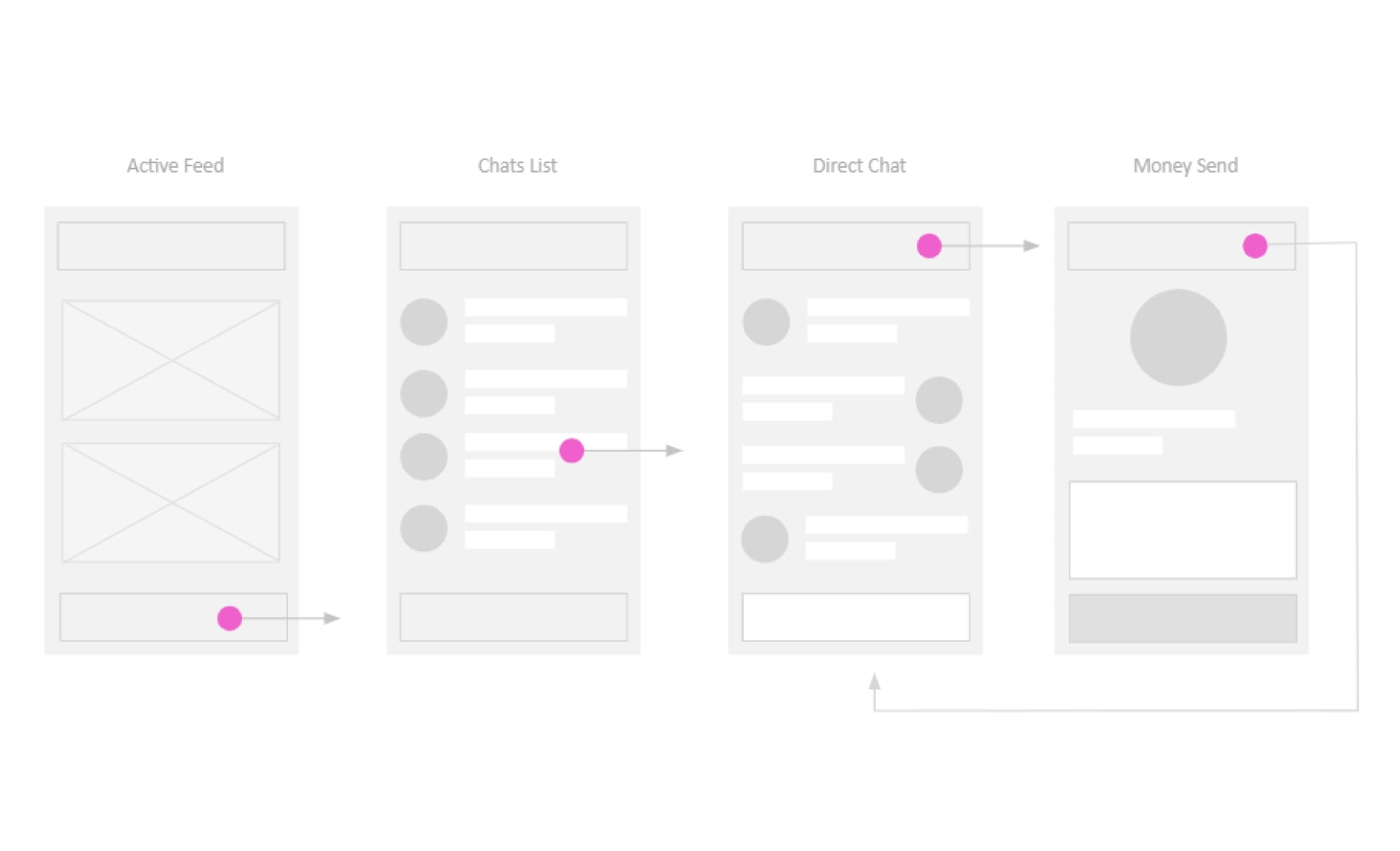
The person clicks on the button in the right upper corner of the chat to open the transaction screen. After that, he/she goes back to the chat and receives a payment confirmation.
Prototyping and Testing
The main objective at this stage was to make sure that real users can easily navigate the prototype app interface and complete their desired action quickly. Based on the feedback provided by the test users, we made corrections to the design and created a flowchart — a graphic representation of the steps users need to take to make a payment transaction. The flowchart allows developers to better understand how screens and graphic elements are connected to each other and which button a user has to tap to go to another screen.
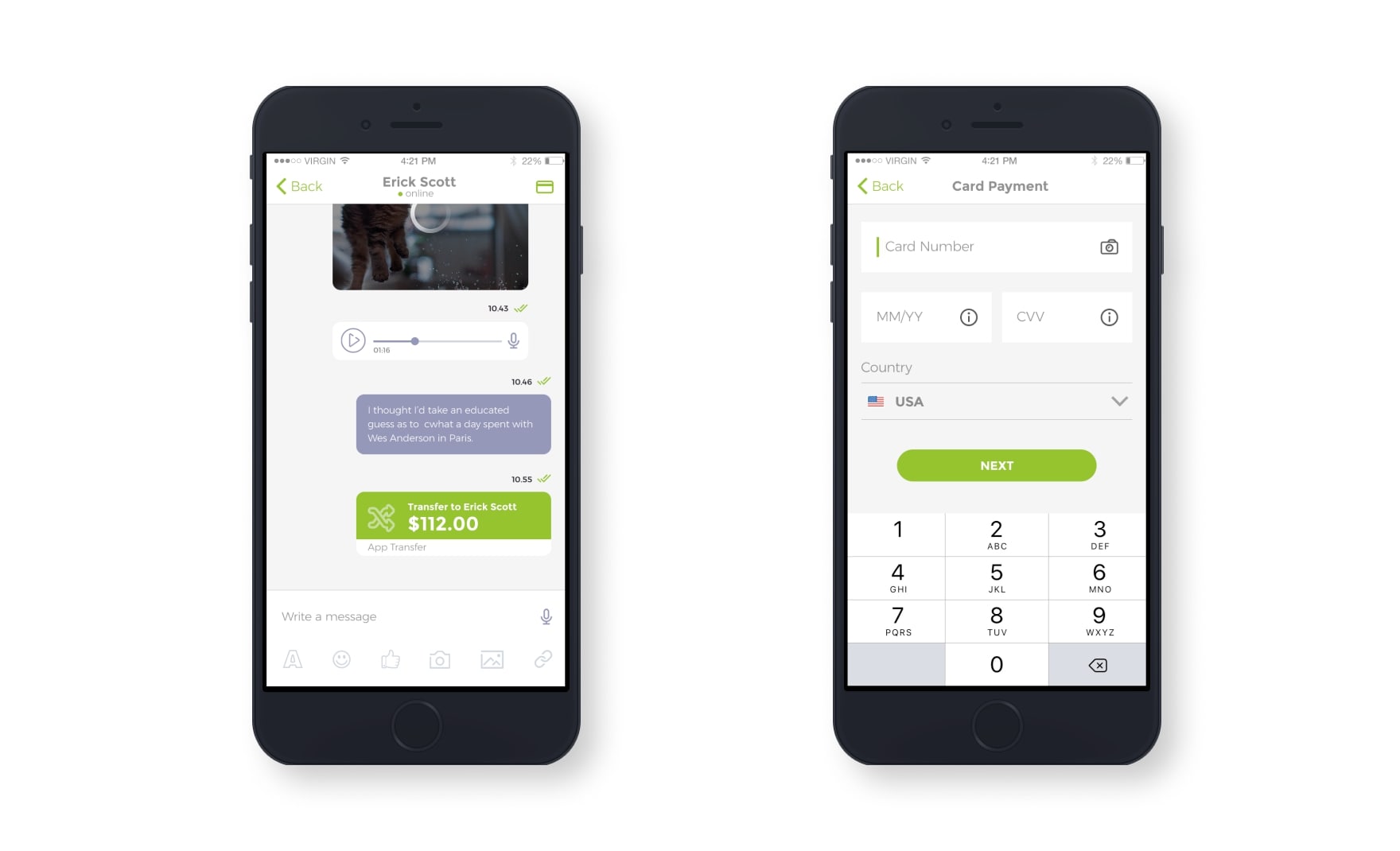
UI Design: Choosing Color Palettes
When choosing a color scheme for the app UI, we followed the customer's corporate style guidelines.
We designed several screens and sent them to the client for approval.
Our goal was to show the maximum number of objects — videos, audio messages, confirmations of the completed transfers, which helped us negotiate the UI features early on. After making corrections according to the client's comments, the screens were ready for programming.
Looking to Elevate Your User Experience?
Discover how our UI/UX design services can transform your digital presence Learn more