Check out our latest blog article: From component to enterprise – modular robotics done right.

Mobile App Redesign for a Cinema Chain
User-friendly ticket and food ordering
The client is a luxury cinema and dining chain. They had a mobile application for buying tickets and ordering food directly at the movie halls. They wanted to upgrade that app to increase user engagement and attract new customers.
Case Highlights
- Improved contrast
- Two color themes
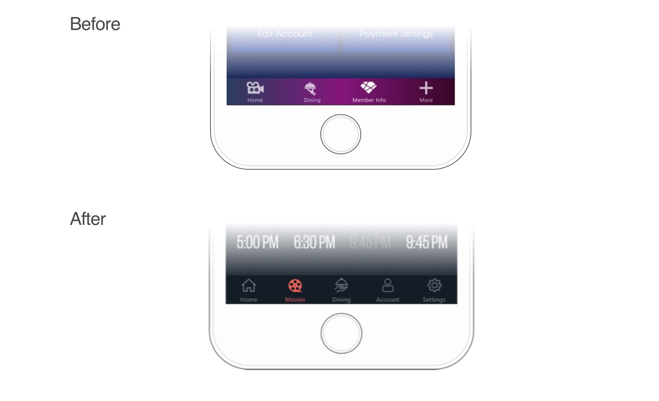
- Optimized app navigation
- Improved interaction with the menu bar
- Optimal field width, more convenient for entering information
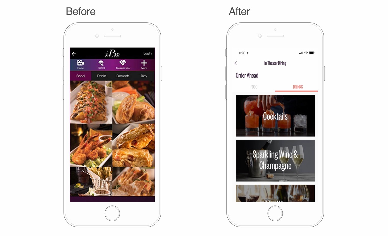
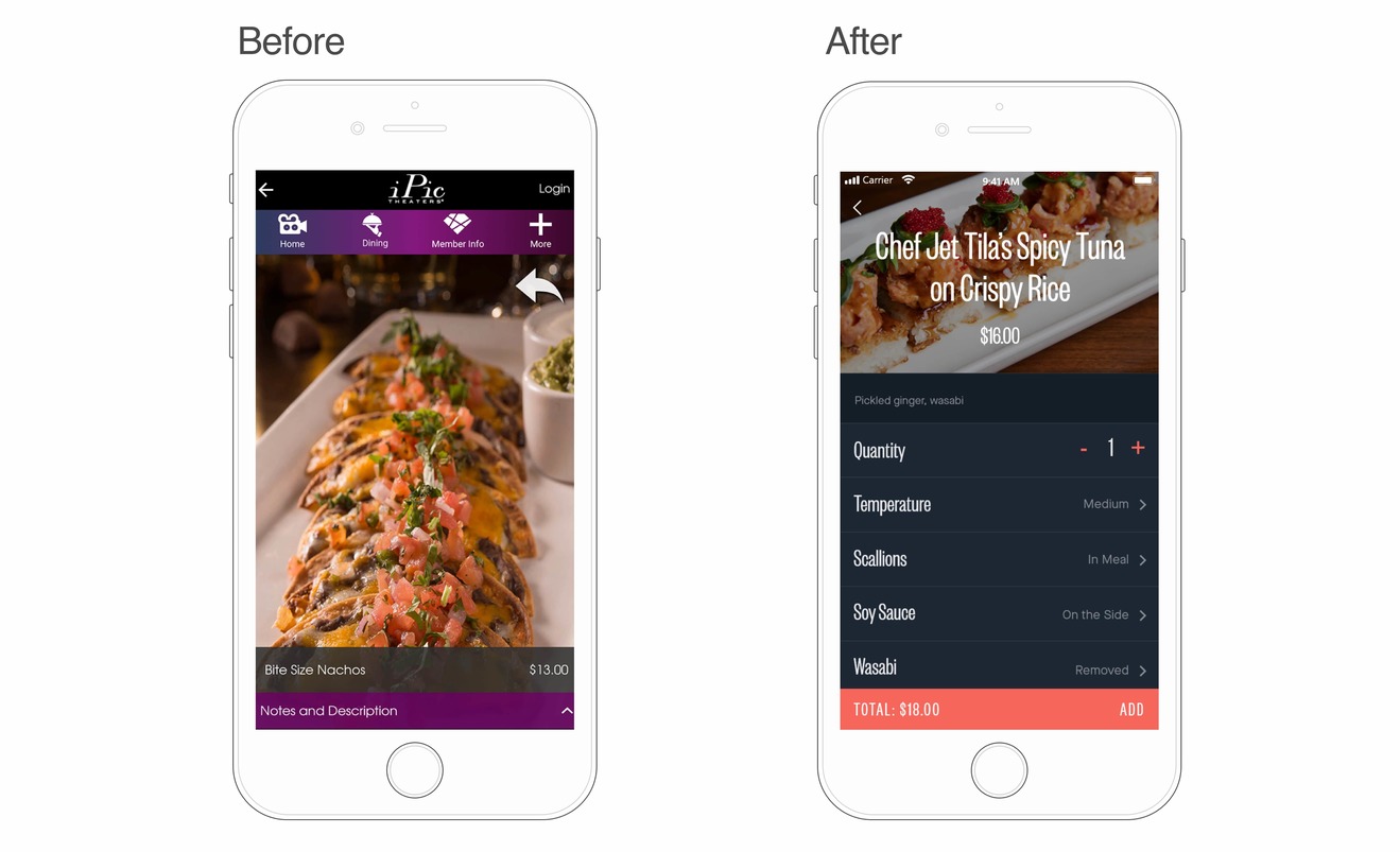
- User-friendly seat reservation and food and drink ordering
Project Information
T&M (time and materials)
LeanUX, Google Design Sprint
UX/UI Designers
Business Analysts
Problem
The client wanted to update their mobile app’s look and feel to make it more modern and user-friendly. Softeq was tasked with redesigning the app. We had to make the ticket reservation and food ordering processes more convenient.
To achieve this, the team would ensure that the app complied with up-to-date design guidelines, improve text readability, and revamp navigation.
Solution

Color Themes
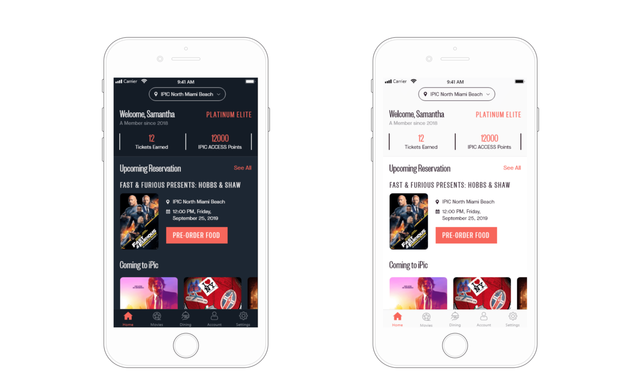
To improve the text readability we added contrast, changing the background and font color to a dark and light color scheme.
Having several color schemes to choose from also accommodates various user preferences. The light theme is more beneficial for text screens, making the screen more spacious and enabling the user to focus more on the content. If the screens contain images, the dark background adds depth to the color. The dark theme is also more convenient for those who are accustomed to the old version of the app.
Payment
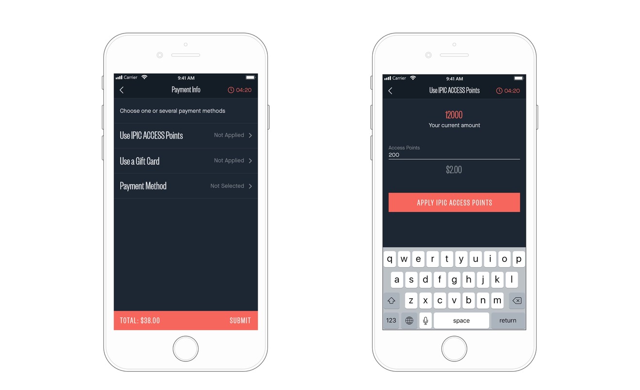
The app offers 3 ways to pay for tickets: by credit card, gift card and iPic Access Points (bonus points).
With the newest version users can combine payment methods, mixing and matching credit cards, bonus points and gift cards as they see fit.
We implemented a simple and understandable payment flow, where users can continue or go back and edit/cancel actions at each step.
First, the user has to choose the amount they want to pay by bonus points. The rest will be paid by gift card or credit card.
Seat Reservation
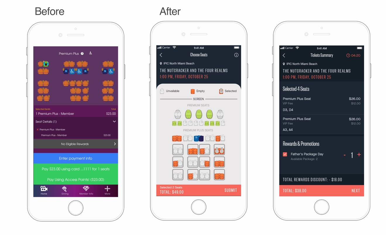
To make seat reservation more convenient, we increased the area of the movie hall, made the seat status (unavailable / free / selected) more obvious, and added a legend.
In order to prevent mistakes when choosing the movie theater and the desired screening time, we added information on the location, movie, show time and date to the selection screen.
To avoid information overload, we moved the section with payment information to another screen.
It is now clear what seats are available and what the next steps are.
Movie Carousel Slider
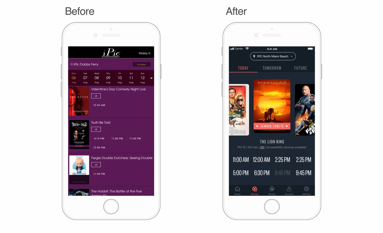
The movie selection screen was packed with information: displaying days of the week, titles, and available showtimes.
To reduce cognitive load and simplify information perception, we regrouped the screen elements and highlighted one movie at a time. We increased the font size of the available showtimes to make it easier for users to select their desired show and implemented a movie slider where showtimes are displayed only after selecting a movie.
To make the location field more visible and that the user selects the right movie theater location, we outlined it, moved to the center and added a location pin icon.
The movie slider enables users to easily navigate through the available movies and showtimes.
Looking to Elevate Your User Experience?
Discover how our UI/UX design services can transform your digital presence Learn more
Result
Intuitive User Experience
The redesigned application is compliant with design guidelines for mobile applications, making sure the interaction experience is understandable and enjoyable. The app features improved contrast, an intuitive payment flow as well as user-friendly seat booking and food ordering.
Related Cases


