Designing UX/UI for a Smart Collar App
The interface combines native design elements with non-standard functionality
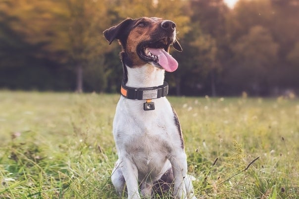
The client is a pet startup that wanted to develop a safe pet monitoring system using a smart dog collar.
Solution
.png)
Arranging the Workflow
Softeq had to reconcile the customer’s vision with UX/UI guidelines and best practices.
We started from the business analysis stage so that we could foresee possible development limitations. The project architecture meant there were many inner dependencies and integrations to consider. To avoid any errors, we decided to render all screens throughout each iteration.
Any further interface ideas from the customer were analyzed by our UX/UI team. After that, we considered some other options to choose from internally. At the client approval stage, we presented 2–3 choices, pointing out the one we recommended.
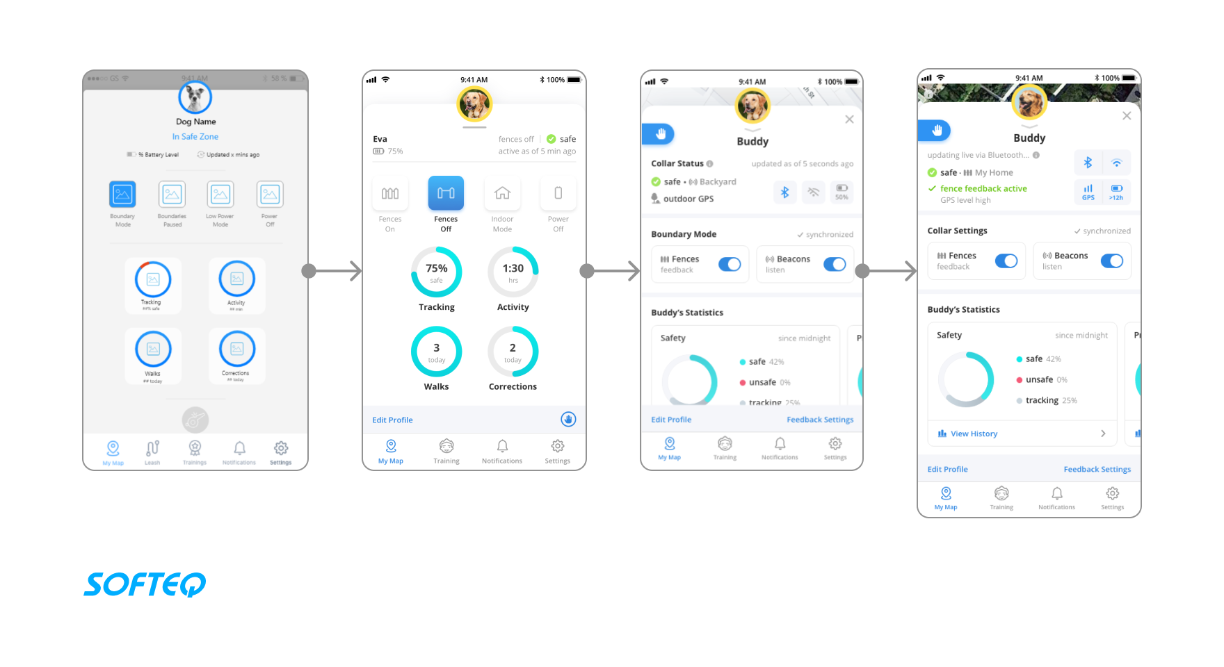
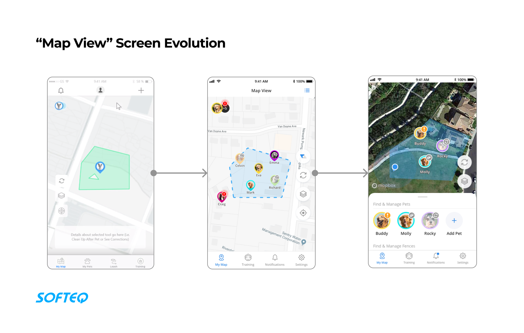
Making App Navigation Simple and Clear
The app has a complicated architecture that includes back-end, hardware, and firmware integrations.
The interface includes lots of non-standard elements that allow users to navigate through the app. The “Pet profile” is the most complex screen—it took the most iterations to make it look smooth yet informative.
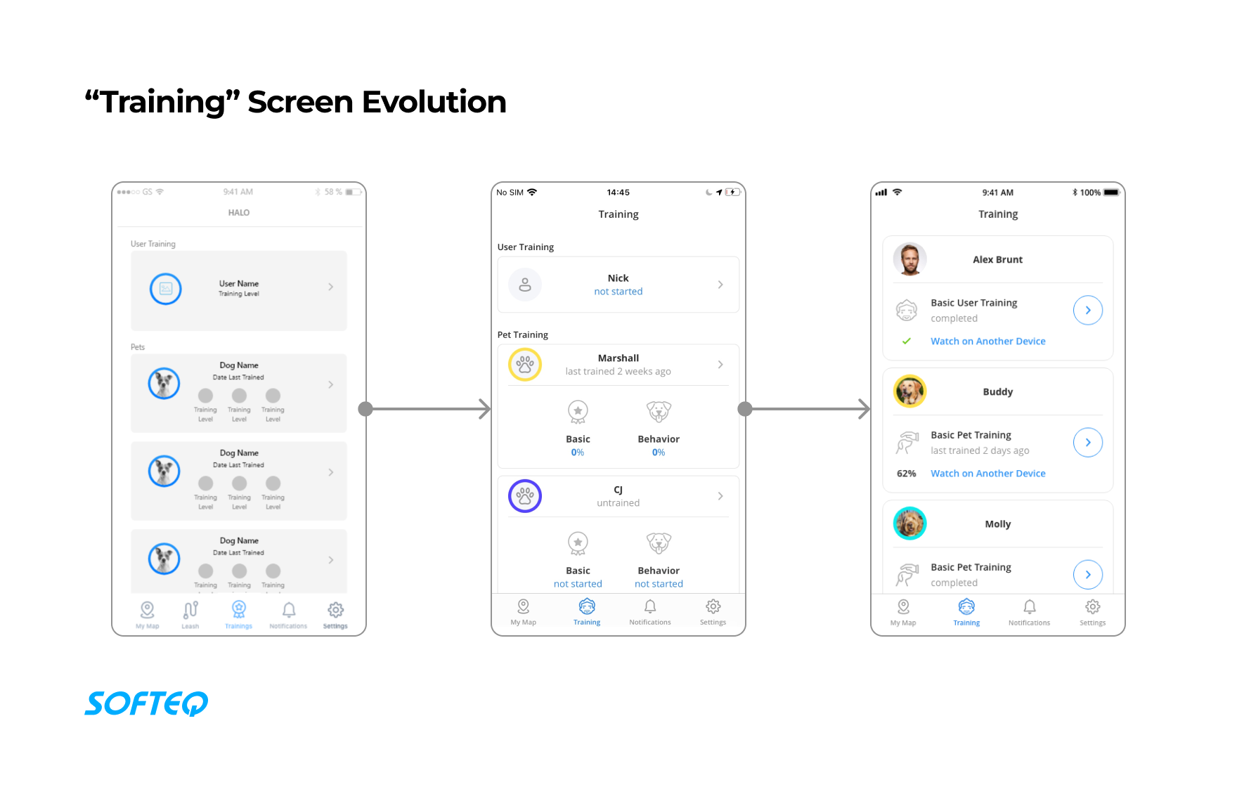
Improving UX and Adding New Features
The solution began as an MVP a few years ago and has now become a whole ecosystem.
The app is constantly evolving, and new features are added from time to time. Our UX/UI team provided an interface that was suitable for functionality updates and alternative scenarios.
New design iterations have been based on 24/7 alert monitoring, feature analytics, and user reviews. Softeq works together with the client to bring improvements to the user experience.
Increasing User Referral Activity
The customer discovered that current app users were not sharing referral codes as much as they would like.
The referrals were being given by the same people, and the customer wanted to increase the number of unique referrers.
The customer came to us with this problem. The Softeq team suggested changing the referral code-sharing interface for end users. Previously, the generated code had to be manually copy-pasted.
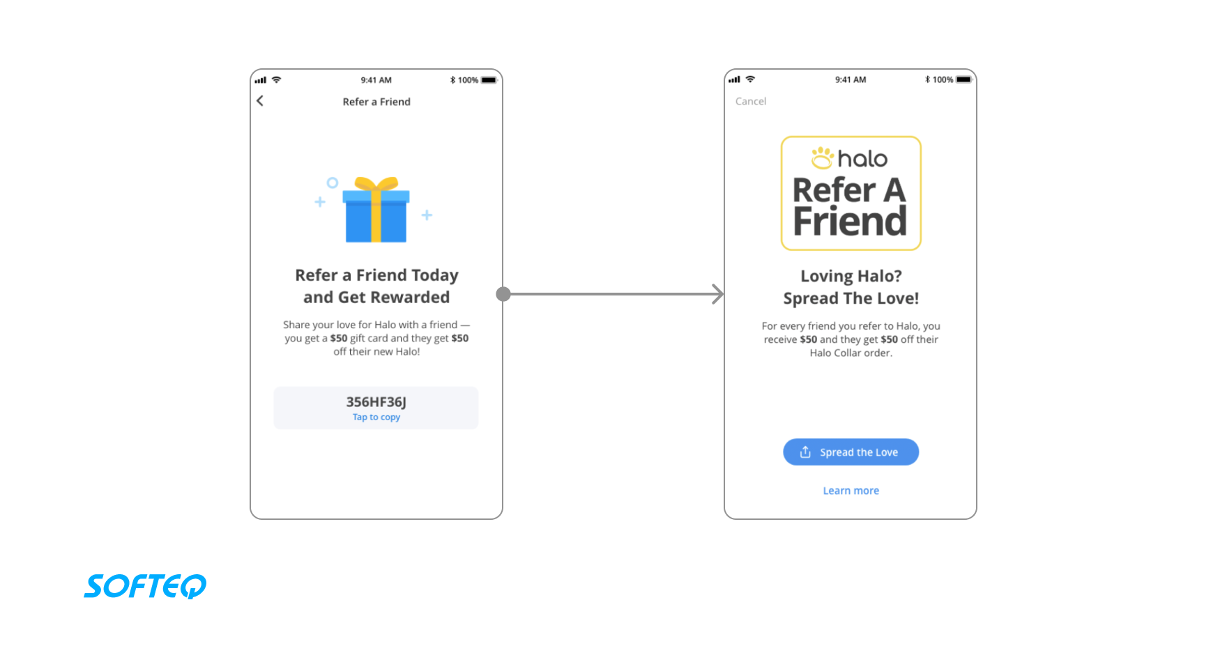
Once implemented, this UX and UI improvement increased the number of referral codes used by 3x in one month.
Looking to Elevate Your User Experience?
Discover how our UI/UX design services can transform your digital presence Learn more